Please refer to Assignments Class 11 Economics Presentation of Data Chapter 4 with solved questions and answers. We have provided Class 11 Economics Assignments for all chapters on our website. These problems and solutions for Chapter 4 Presentation of Data Class 11 Economics have been prepared as per the latest syllabus and books issued for the current academic year. Learn these solved important questions to get more marks in your class tests and examinations.
Presentation of Data Assignments Class 11 Economics
PRESENTATION OF DATA
Important terms and concepts:
1. Tabulation – Orderly arrangement of data in rows and columns.
2. Objectives of Tabulation:
a] Helps in understanding and interpreting the data easily.
b] It helps in comparing data.
c] It saves space and time.
d] Tabulated data can be easily presented in the form of diagrams and graphs.
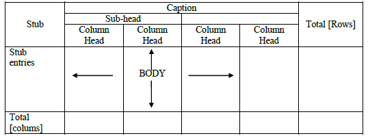
3. Main parts of a table.
a] Title of the table – It is a brief explanation of contents of the table.
b] Table number – It is given to be used for reference.
c] Captions – A word or phrase which explains the content of a column of a table.
d] Stubs – Stubs explain contents of row of a table.
e] Body of the table: Most important part of table as it contains data.
f] Head note: Head note is inserted to convey complete information of title.
g] Source note refers to the source from which information has been taken.
h] Foot note: It is used for pointing exceptions to the data.
FORMAT OF TABLE
Table Number: ………….
Title: …………………….
[Head note]
Source Note:
Foot Note :
Types of Table:
1. Simple Table – data are presented according to one characteristic only.
2. Double Table – data are presented about two interrelated characteristics of a particular variable.
3. Three way table – This table gives information regarding three interrelated characteristics of a particular variable.
4. Manifold table – This table explains more than three characteristics of the data.
Diagrammatic Presentation of Data
Utility or uses of diagrammatic presentation:
1. Makes complex data simple.
2. Diagrams are attractive.
3. Diagrams save time when compared to other methods.
4. Diagrams create a lasting impression on the minds of observers.
Limitations of diagrammatic presentation:
1. They do not provide detailed information.
2. Diagrams can be easily misinterpreted.
3. Diagrams can take much time and labour.
4. Exact measurement is not possible in diagrams.
Kinds of diagrams:
I. Line diagrams – Lines are drawn vertically to show large number of items.
II. Bar diagram
1. Simple Bar diagrams – These diagrams represent only one particular type of data.
2. Multiple Bar diagrams – These diagrams represent more than one type of data at a time.
3. Subdivided Bar diagram or Component Bar diagram – These diagrams present total values and parts in a set of a data.
III. Pie diagrams – Circle may be divided into various sectors representing various components.
GRAPHIC PRESENTATION OF DATA
Advantages of Graphic Presentation:
1. Graphs represent complex data in a simple form.
2. Values of median, mode can be found through graphs.
3. Graphs create long lasting effect on people’s mind.
Disadvantages of graphic Presentation:
1. Graphs do not show precise values.
2. Only experts can interpret graphs.
3. Graphs may suggest wrong conclusions.
Rules of Constructing graph:
1. The heading of the graph should be simple, clear and self explanatory.
2. Graphs should always be drawn with reference to some scale.
3. False baselines should be drawn if the difference between zero and the smallest value is high.
4. Index should be made if different lines are drawn as in time series graphs.
Types of Graphs:
1. Line frequency graphs – Such graphs are used to represent discrete series.
2. Histogram – A two dimensional diagram whose length shows frequency and the breadth shows size of class interval.
Frequency Polygon: A histogram becomes frequency polygon when a line is drawn joining midpoints of tops of all rectangles in a histogram.
Frequency Curve: Smooth curve joining the points corresponding to the frequency and provides frequency curve of the data.
Ogive : A curve obtained by plotting frequency data on the graph paper.